Work Contact


2025
Oktoberfest
Process —>
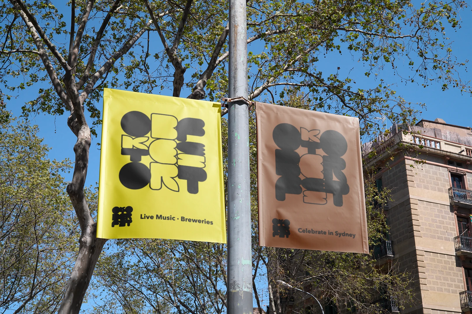
Designed for an Oktoberfest with a diverse and unique music line-up, the custom type and color align with the festival's goal of being a bright, inviting, and unexpected.
Visual Identity
Type Design
Poster Design
Microsite
2025
2025
2025
2025
2025
2025
Designed for an Oktoberfest with a diverse and unique music line-up, the custom type and color align with the festival's goal of being a bright, inviting, and unexpected.
Visual Identity
Visual Identity
Visual Identity
Visual Identity
Visual Identity
Visual Identity
Type Design
Poster Design
Poster Design
Poster Design
Poster Design
Poster Design
Microsite
2025
Oktoberfest
Process —>
Designed for an Oktoberfest with a diverse and unique music line-up, the custom type and color align with the festival's goal of being a bright, inviting, and unexpected.
Visual Identity
Type Design
Poster Design
Microsite
Designed for an Oktoberfest with a diverse and unique music line-up, the custom type and color align with the festival's goal of being a bright, inviting, and unexpected.
Visual Identity
Type Design
Poster Design
Microsite
2025
Oktoberfest


Alda OT CEV & Avenir
Alda OT CEV & Avenir


Violet #EE88FF
Violet #EE88FF
Violet
Violet #EE88FF
#EE88FF
Rose Taupe #7A5C61
Rose Taupe #7A5C61
Rose Taupe
Rose Taupe #7A5C61
#7A5C61
Maize #FDF050
Maize #FDF050
Maize
Maize #FDF050
#FDF050
Bittersweet #F76F59
Bittersweet #F76F59
Bittersweet
Bittersweet #F76F59
#F76F59
Russet #7A4419
Russet #7A4419
Russet
Russet #7A4419
#7A4419
Graphic Elements
Graphic Elements